St. Jacques Tube and Rail Services
Plan de Réseaux des Transports de Saint-Jacques

After just under a year, I have completed the digital map - with key, zones and grid included! I hope to produce a foldable map with the index of stations included. Watch this space!

Click to enlarge | Cliquez pour agrandir | PDF

Click to enlarge | Cliquez pour agrandir | PDF

I've kept the separate photos for now, so for a close look click on separate images to enlarge.

Link to Key

Separate Line Diagrams (Under Construction)

UNDERGROUND

CROSSRAIL

OVERGROUND

TROPICAL LIGHT RAILWAY

TRAMWAYS

PEOPLE MOVER

TIGERLAKE AIR LINE

CORTE FUNICULAR

Previous Versions

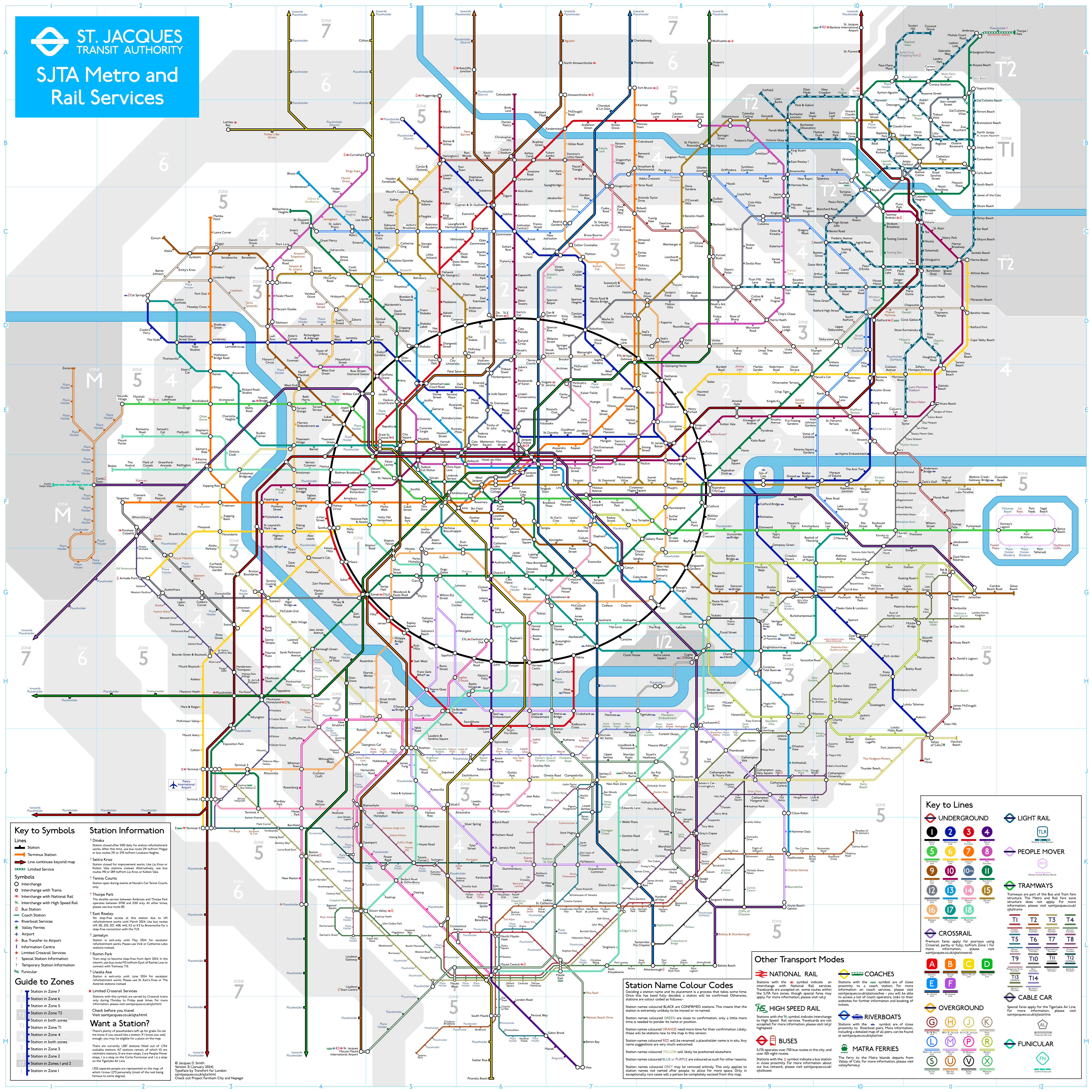
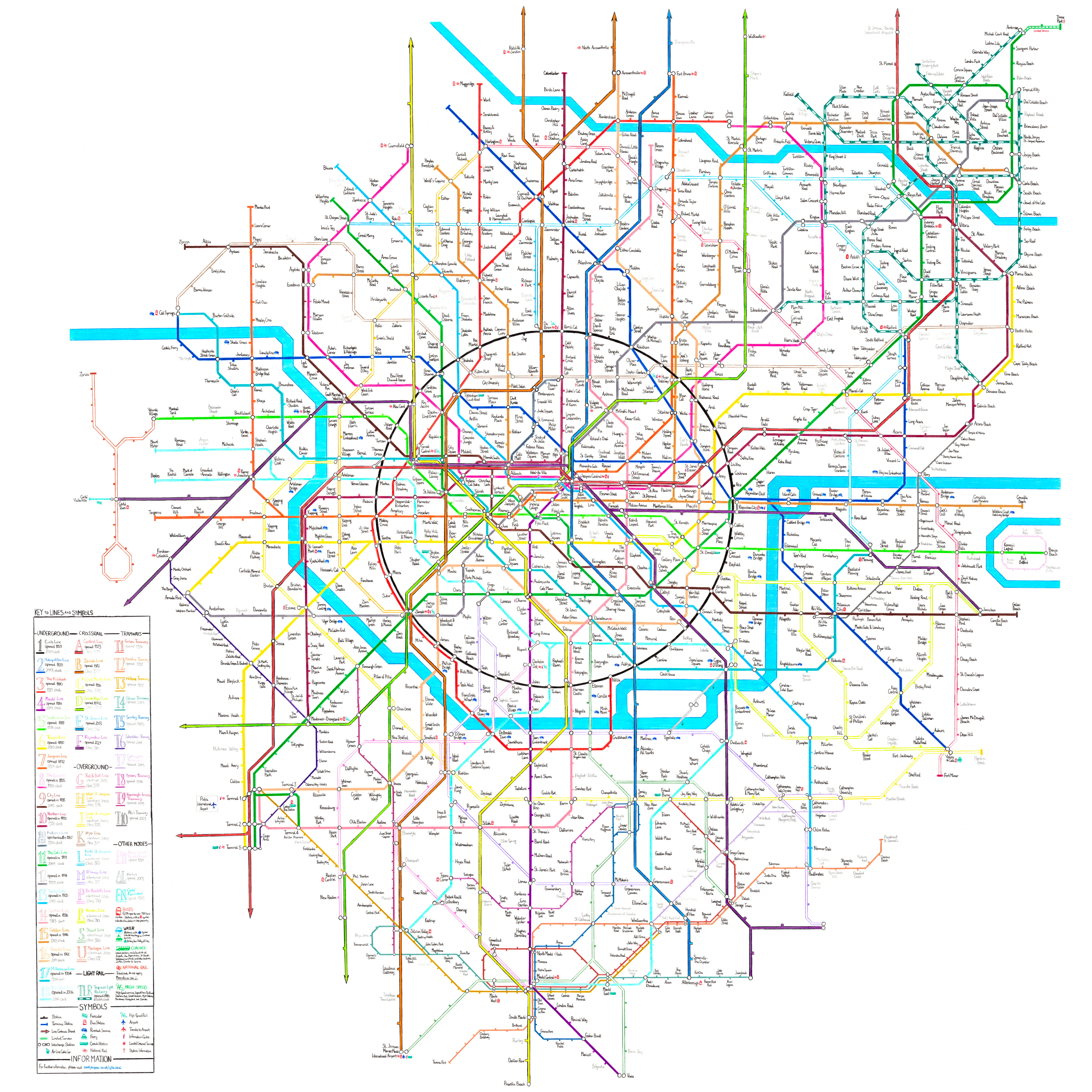
The St. Jacques Tube and Rail Services Map is a custom metro map for my fantasy city. There are two versions of the map - one fully hand-drawn, and one drawn using vector software. Almost all stations on the map are named after friends I have met along the path of my life.

The hand-drawn map is drawn on three sheets of A1 paper and six sheets of A2 paper, measuring 1680mm by 1782mm.

Pour Les Corses

Find Your Station

People in certain groups are placed together in the same area, or on the same line.

Starting from the centre, then the north-west going clockwise, here are the groups represented on the map.

Frequently Asked Questions

Is this map based on the London Tube Map?

No, this map is an entirely original design by me, starting from a rough scribble using different coloured Stablio pens, and evolving over several variations. The map is not based on London or its tube map, nor is it the London tube map with stations named after people, which tends to be the first thought (there’s enough of these tube maps as it is, and that sort of thing can be done in an hour on MS Paint.)

The city above the lines/tracks is totally visualised in my head, in some cases right down to the street geography. It is a completely fantasy city.

There is certainly a lot of inspiration from the London Underground when it comes to the design features of the map, however the map is actually just as inspired by the Paris Metro as it is by the London Underground - certainly when I first scribbled it out back in 2012.

Where’s South Kensington on the map/Is that the Victoria Line?

Once again, the map has nothing to do with London. There is no ‘South Kensington’ (though an area in St. Jacques is indeed similar to South Kensington - you can find a lot of museums in Robotham). 

And again - the lines are actually numbered rather than outright named, though each line has an official nickname shown in the key. So the light blue line isn’t the Victoria Line, it is Line 13 (Simba Line). The dark blue line isn’t the Piccadilly line, it’s Line 2.

(There is a Tottenham Court Road station… only because that name has stuck with me since my early childhood).

Do I have a station?

If I have met you after September 2012, and I have had several conversations with you (real life or online), you are almost certainly on the map. I’ve tried to put everyone from my Chemistry course in (bar one person).

I may have missed you out. Don’t worry, there’s still space. If you don’t have a station and think you warrant a space, feel free to message me, and if I accept, I will decide a spot for you. The station will likely be pencilled in for some time before confirmed in pen.

Where am I on the map?

If you scroll up, there is a bullet-point list of groups of people and where their stations can be found on the map.

I can't find my station anywhere!

Send me a message and I’ll tell you where the station is.

Why am I in a particular place on the map?

Stations for people are placed in groups, from where I have met them. For example, baseballers have an area, colleagues have another area.

Some stations were named or placed because of the bus network (yes, there is a bus network in St. Jacques, who the hell do you think I am?). The explanations are complicated… but if you’re intrigued…

Why am I so far away from the centre?

The map began in 2012, and naturally many of the first stations added were in the centre. I don’t particularly like moving stations around so they have remained there ever since. If I met you before 2015 you are more likely to be in the centre.

Just because you are not in the centre doesn’t mean very much. Central St. Jacques is stunning but so is the city outside of the central area. Just like London, there is just as much interest in the out of the centre as there is in the centre. As a Londoner, I don't go into Central London all that often as there's much to keep me interested out of Zone 1. Also, stations on the east side of the map are near or at beaches. The Maute area (South) and Tropical area (North-East) are also centres in their own right.

Someone I know was a little disappointed with where his station was placed - he wanted to be placed in the centre (I wouldn’t want to do this as it would be away from his group ultimately). His station is near the end of a line, but on what is a beautiful island, by a stunning beach. I would consider that a very good space on the map!

Why is my station name in pencil?

Station names in pen are completely confirmed and will not change position or name. If I plan to change a station’s name and/or position, it will be in pencil until the final decision has been made.

I don’t like my station name or placement.

If it is in pen, I can’t change it. Sorry. I’m not tippexing anything  or cutting little bits of paper to stick over old names anymore. It could potentially be moved in the computer version, however I'd rather keep both maps consistent.

What sort of area does my station serve? What landmarks are there in my area?

Ask me - I’ll let you know.

Why is my cat on the map?/I don’t own a cat…?!

St. Jacques is the capital city of a country where cats form a major part of the culture. Akin to ancient Egypt and how they revered cats. Indeed, much like Istanbul, cats that are well cared for roam the streets of the city, and are very much a tourist attraction.

A station named as such: ‘xxx’s Cat’… such as Kerry’s Cat or Dean’s Cat, is in honour of the cat culture - it is a station for you and not your cat. 

These names came about from a station on the DAOS map, and incorporated here.

A few people which have stations named as such are known to really like cats or own many of them.

Three cats do have stations on the map - all of them my cats.

Why do you keep redrawing the map?

Simple answer - because it is fun! And also, because the map needed evolving.

If you flick through versions 1 to 5, you can clearly see the evolution of the map, and the fine-tuning of my methods of drawing the map. Version 1 is extremely crude, improving immensely by the time Version 5 is reached. See below for the story of the map.

Will you be drawing another version in the future?

Almost certainly not, unless you can think of a new transport mode that I haven't included on this version (Elon Musk-esque craziness will not be on the map, by the way). I’m very happy with it and don’t think it needs any further changes. Then again, this is what I said about Version 4 almost 6 years ago...

I want to focus on a new metro map for DAOS next, and perhaps some commissions if someone wants me to do something similar for them (Discalimer: I won’t be designing anything for anyone with 49 lines, far too much work, unless for a hefty price haha!)

Have you ever completely removed a station that belonged to someone?

Only a very, very, very tiny number of people (that I personally know) have had their station removed. You have to really, really wrong me to get your station excised from the map!

Why are some stations coloured red or grey on the digital map?

Stations in grey are not named after people, and are likely to be removed and renamed - to allow more space for people. These stations were on the map early on - when I was trying to pad the map up with more stations at the beginning.

Stations in red are this way for two reasons:- (1) These stations may be renamed as the place name has not been finalised; (2) These stations may move elsewhere on the map.

My station is on the digital map but not on the hand-drawn map/My station is black on the digital map but in pencil on the hand-drawn map. Why?

The maps aren't really in sync on the website. The photo of the hand-drawn map is from April 2021, whilst the latest copy of the digital map is from December 2021. I tend to take a little more time to 'confirm' stations on the map (add them in pen) rather than on the computer. Bear in mind I am trying to get the hand-drawn map scanned so I can process it into a high quality image - there have been quite a few confirmations since April 2021.

Will you be creating a new version of the digital map in the future?

Maybe... there are a few flaws I find with the digital map - mainly the east side being slightly more spaced out than the west side. Also,  the zone 1 shape is quite wonky (as the zones were added later on after the lines and stations were placed). I may attempt another version which looks neater - but time is scarce these days as more things open up. A new digital map is far more likely than a new hand-drawn map.

I would like to buy a copy of the map.

I know some people are interested in owning a copy of the map. I will eventually have folded maps for both the hand-drawn and digital map up for sale (I doubt anyone would want a large poster printed of the map, but you never know). The hand-drawn map will need to be scanned first so I can combine each separate piece of paper seamlessly. The digital map will require some changes - the index of station needs to be added, all stations are to be shown in black text. I will also need to remove the National Rail symbol from the map and design a new logo as it is a copyrighted symbol. I may have to also change the font from TfL's Johnston font to Gill Sans MT (the text shown on this website) as I am unsure if I can use the TfL Johnston font on items I will be selling.

I would love to offer the map for sale though to those interested - watch this space!

I would love my own map.

I have already drawn a map for one of my friends, and I know there is a lot of interest. I might be interested in commissions - drawing you a custom map (hand-drawn always looks more personable). Let me know a plan and I'll see if I could do it for you. What would help would be drawing a rough version on the Beno Map Creator first.

Your website looks awful.

I want to design a decent looking, interactive website for the digital map - paired with the bus network (yes, of course there is a bus network - I indeed have a list of routes!). This simple text website is enough for the time being to present one image, but I will have a proper, functional website in the coming months (yes, with an SSL certificate, Paul, promise!)

The Story

It all started when I was a toddler.

My earliest vivid memory, that I still remember to this day, involved the tube.

The 1959 stock on the Northern line was still running, and the London Underground seemed like an uneasy place to be. However, it was not long until the 1995 stock trains were due to enter service. The new train was waiting for my mum and I on the platform at High Barnet. I somehow felt a lot safer on this brand new train.

My mum and I used to go shopping at least once a month in the west end, so the tube ride from High Barnet to Tottenham Court Road was part of my early life. Each time, I would hope a 'new' train would await at High Barnet - but most of the time, the 1959 stock would be standing on the platforms.

But the once uneasy environment became one of intrigue. I would stare at the maps, wondering what all the stations were like. What’s it like in Morden? What’s interesting in Balham?

I remember one weekend - there must have been engineering work on the Charing Cross branch, so we reached Tottenham Court Road via the Central line. At first, I was bemused - another Tottenham Court Road station? My mum explained to me about the concept of interchange stations.

My mum noticed this interest in me, so she began to bring back tube maps home for me as we picked her up from High Barnet station. I’d study them and see if I could memorise the whole thing. I wanted to visit every corner of the map, from Heathrow, to Chesham, to Epping. I was also very intrigued about the Waterloo & City line, asking my mum if we could try it out. My mum, not being nearly as much of an Underground enthusiast as I was, was never happy to oblige. We were to ride on the tube for as little time as possible - that was the agreement.

Every time a new tube map was released, my mum was sure to bring it back for me as soon as she could find one. I remember being very excited about a design for the Chinese New Year, where dragons taking over the map adorned the cover. I even day-dreamed about receiving it at school. Would the entire map be filled with dragons? I was a little disappointed that this very impractical idea was not implemented in the map itself, but it was such a cool cover that I didn’t mind. To this day I have most of the covers from about 2001, though I have a small hiatus from the time when my mum left England in late 2005, to riding the network with my aunt more often starting in 2007. Perhaps Geoff Marshall could help me fill in the gaps.

Here I was - tube mad. I would remember being very disappointed when my dad offered to drop us off into town using the car. I would much prefer to take the tube. I remember even throwing a tantrum when we took my dad’s car instead of the Northern Line to the West End.

Whilst at primary school, I began to run around the playground aimlessly, pretending to be a Northern line train, during break time. Lunchtime was time with my friends, but break time was sacred - my inner being transformed into 6-car set of 1995 stock. I soon, in my head, developed a little tube system. (I may have drawn it out, but that piece of paper was long gone).

This tube system would serve my first fantasy city, to which I had never given a name. There were a lot of motorways (I was also obsessed with motorways as a child), and 1,089 tube lines. 1,089! I barely named any of them. There was the Wellies line, the Wait Long line (with trains that sounded like washing machines and would stop for stations for a long time, for no reason at all). There were lines for each person in the class, along with a Ciaran line, with many stations named after gross things.

The line I would think most about was the Class line, running from Eamonn Gate to Gemma Gate. In school register (surnames alphabetically) order, each person would have a station named after them. The Class Line's rolling stock was the 1995 stock, of course. When riding the real Northern line, I would imagine I was riding the Class line instead (though without the immense interchange stations, of course). To this day, 16 years later, I can still recite the school register in order because of this.

***

I can pinpoint the moment my interest in the tube further intensified. Whilst on a walk through Central London with my parents, I noticed a Routemaster bus on route 9, running to Aldwych. Where was Aldwych? Was it on the tube map? As soon as I got home, I scoured my latest tube map for an Aldwych, to no avail. I even looked at my National Rail map as well. I checked the station index but there was no entry. Where was this mysterious Aldwych?

I did some research on the computer to find that there was once an Aldwych station, which closed in 1994. I saw pictures of the disused platforms, and discovered that there were plenty of abandoned stations on the network. Down Street, British Museum, City Road, amongst others. On my next trip to Tottenham Court Road, I would remain especially concentrated between Kentish Town and Camden Town, to see if I could spot the abandoned platforms at South Kentish Town station. ‘There it is Maman, South Kentish Town station’. My mum smiled, but remained uninterested.

I would read through the entirety of the Abandoned Tube Stations website, and Nick Catford’s website which went into more detail about the Piccadilly line stations. I was a little spooked by the dirty, dusty abandoned platforms - I even had a few nightmares about being left there alone. The tube was still a little disconcerting to me though it carried much intrigue. One thing I absolutely hated was the DLR between Bank and Shadwell. For some inexplicable reason, it completely creeped me out, so much that I never looked forward to the Disney on Ice shows at the London Arena,  as I would have had to take the DLR! (I should have asked my mum if we could catch the DLR from Tower Gateway instead!)

I got over my fears eventually - I saved the pictures, and made my own site (never went live - it contained copyrighted picture from the sites they came from). Characters from Winnie the Pooh would take us all on a tour of each abandoned tube station - with Piglet repeatedly saying how creepy the surroundings were. (My teachers were very impressed!)

I received plenty of books for Christmas about the tube, including one about the abandoned stations. I have kept every single one of my books about the tube I’ve received or bought)

***

Embarassingly, I continued with my spiritual train game during break times in the first term of secondary school. As I began to fit in and make more friends at Dame Alice Owen's, it wasn't very long until I started to create a new tube map.

However, I could not create a 'Class line' to the same vein as in primary school, as there were 200 people in my year group instead of 30! That would make an immensely long line.

The network this time was a little more grounded in reality. The network eventually ended up with 15 lines (with up to around 120 stations), and a not very fleshed out Overground and DLR service. A tram service was merely mentioned, never drawn.

The city of Napega was born (formally Conapega). There are images of some of the lines here.

One night, I drew what would become Napega’s first established line - the Northern line, on Microsoft Visio. I wasn’t very imaginative with my names - most lines on the Napega were named after existing Underground lines - though I will be changing this for Napega's new map.

I would begin to hand-draw the maps of each line on paper. Soon, I learned how to use Photoshop, and decided to draw the rest of the lines on there, and transfer existing lines on paper digitally. I admit that Photoshop was an odd choice to use. To create the maps, I would take existing tube line diagrams and chop and paste them to create Napega’s lines.

The problem that Napega's metro network had was that so many stations had interchanges. Napega was designed to be quite a long, thin city, continuous beaches adorning the west. It was all well and good having all the lines ready, but try and put them together and you’d end up a right mess. Even putting two of the lines together would be a contrived exercise.

Just imagine putting the extremely complicated Northern Line and the Heaselang into one diagram. The Heaselang line will completely zig-zag and spiral around the Northern Line. Image this with 13 other lines, along with an Overground and DLR service. It just didn't work at all, hence why I intend to redesign it soon.

***

One trip provided particular inspiration which ultimately resulted in this map. The French Exchange trip in 2011 (a bloody fantastic school trip) took me and some classmates for a week in Paris. We stayed in Franconville, coincidentally twinned with Potters Bar, the location of my secondary school...

Being French myself, I'm sure my exchange, Adrian, was relieved that he could be with someone who he could hold a conversation with in French (though I had the advantage overall). But he was extremely, extremely bemused when he found out that the number one thing I wanted to do in my visit to Paris was to ride the Paris Metro. I had to be honest - I had visited Paris before many times and had done all the sights. My mum was very afraid of the Paris Metro after once observing someone getting assaulted on the opposite platform to where she was standing in the past, and we always avoided taking the metro, instead travelling in my dad's car.

The Paris Metro carried much intrigue, and it still does to this day. It expands at a rate far faster than the TfL network, with new tram lines and extensions to existing Metro and RER lines being a common occurrence. The Paris transport network evolves at a far faster rate than London's.

This trip would have been a good opportunity to discover the metro. My dream situation would be a day with him trailing along... where I ride every corner of the metro (I was particularly intrigued by Line 3bis, which seems to be Paris's version of the Waterloo & City line, but unlike London's Waterloo & City line, it is an almost pointless stub in the network to fill in a gap).

Realistically, that never was going to happen, and in hindsight I wouldn't want to subject poor Adrian to such an expedition. Franconville was not on the Metro, being relatively far away from central Paris, but on the RER/Transilien. Remember that the Paris Metro mostly stays in central Paris only serving a handful of inner suburbs. I also tend to be far more interested in the Underground than National Rail services (though my interest in the latter is getting bigger) - so the RER wasn't too much of an exciting thing for me - though I still was intrigued. During the trip, we mostly stuck to RER Line C. Double-decker trains were quite a novelty, now that I think about it.

On the Saturday of the trip - school was out. I had an opportunity to hang out with Adrian, as well as my friends and their exchanges.The other attraction that I mentioned in my itinerary was Paris's Science Museum, so Adrian and I went there to start the weekend off. Nearest station, Porte de la Villette - line 7. 

Porte de la Villette! Line 7. I finally got to ride the metro.

Only to be very disappointed with the dirty, drab, dreary, depressing MF 77 trains. They remain my least favourite of Paris's rolling stock for this very reason. Line 7 seemed to have haunted me - as subsequent trips to Paris - one with some friends from uni (unfortunately I only ended up with a bloody cold so was miserable the entire trip!), one with my ex-boyfriend - meant we stayed in Tolbiac. Another crazy coincidence - The hotel which me any my uni friends stayed, and my ex-boyfriend's friend's place in Paris were two minutes walk away from each other. Tolbiac was on line 7...  so yes, more MF 77 rides. By now I believe all those horrible trains have been refurbished and they do look a lot nicer.

One more mark against the MF 77 trains were - they didn't make any distinct sounds, unlike the rolling stock of the London Underground tube stock. Adrian could sense my disappointment. In his head - he thought 'This is what this weirdo wants to visit? This of all things?!'

But all was not lost. After a visit to the Cité des Sciences et de l'Industrie, Adrian wanted to meet some of his friends near the Champs-Elysees. We had walked to a station on Line 5 (I can't remember off the top of my head  - Ourcq, maybe?). The trains on line 5,  with MF 67 trains running on the line at the time, were much nicer, even being older than the MF 77 trains. Change at Jaurès for Line 2.

Line 2 was a completely different experience. Newer trains, which made an interesting little screech. We travelled through the outer section of the line, along the viaducts, viewing the buildings of Paris at a new angle. Nothing of the sort in Central London. I began to fall in love with the Paris Metro. Whilst everyone was chatting, I was looking out of the window.

I don't think we made any more rides on the Metro for the rest of the trip - but that was more than enough. I thanked Adrian at the end of the day as we reached his house, late on Saturday night.

I took several copies of of the Metro map home with me, studying all the lines. I liked the simplicity of the lines being numbered instead of having names. One day I would hope to ride more of the network,  and try out all the trains. That trip had an effect on me - I believe after the trip I wanted numbered lines - though the Napega maps were established. I believe that is where the convoluted and underdeveloped Overground service came about - if you notice the Overground lines are numbered.

In all honesty, I don't like the Paris Metro map very much,  even though I was inspired by it. I don't like the drab colours chosen for many of the Metro lines. I don't like station names on top of rivers, or on top of the lines themselves. I don't like lines that bend too much. Paris Metro's map has all of that. Mine avoids it. Harry Beck did a beautiful map for Paris after creating his iconic Underground map. It was unfortunately shunned.

(P.S. Yes, Adrian does end up with a station on this metro map for putting up with me for two weeks, and for his little contribution to inspiring me to do this map).

***

October 2012 was the start of my first term at Imperial College. I fit in far quicker than I did at secondary school. I was very much glad to leave secondary school by that time. Year 13 was definitely my least favourite year in school by a very long shot, and not because it was the final year of my A-Levels.

By Year 13, all of my friends throughout school were doing other subjects. Year 12 had its moments, as I still had French class (and it was of course the year of my French exchange!) French was my least favourite subject by far of my A-Levels, but hey, it was an easy A-Level. I much preferred Maths, Chemistry and Physics. However, the people in my French class meant that it was the one to look forward to within the 18 rather drab hours (though they had their moments)! We had a blast in French - I still try and keep in contact with most of them!

Unfortunately in Year 13, I just didn't fit in very much, especially Maths class. And it was 8 hours a week. What was supposed to be my favourite subject just ended up a massive meh. I did not fit in very much with the rest of my classmates, all pretty middle-class folk. I just kind of gave up by the end. I got a C in Further Maths - big whoop, it wasn't needed for my degree - I had lost the will.

But a new environment, and a new start! New people to meet. I really enjoyed uni (though squandered the first term and a half of uni as I was a little scared of nightclubs). I was so excited that I met up with a few of my coursemates before term officially started (and those people have ultimately ended up with some of the larger stations on the map as a result).

I wondered... should I do a tube map of all the people I have met at uni? I thought not. I'm too old for that silliness now. I'm an adult now - and I have to focus on my studies instead of dreaming up silly fantasy cities like a child.

But just a couple of days later, I started planning a Metro! This time, I would scribble out the network in its entirety to start off with, instead of creating separate lines. This meant I would have a coherent, realistic network. There would be 20 lines in total. The first official drawing of the Metro is seen here. The primary concepts are seen. A Circle line encompassing the centre of the city. Jacques Central would be the station right in the centre. The stations on the Circle would be named after people in my course. I believe the initial plans were to have the entire Chemistry year on the circle, but with around 140 students, that would be pretty intense and almost as crazy as the Napega map. I had begun to attend Imperial's societies - baseball was the first one - so the first baseballers got stations on the map - on a bizarre little line which did not enter the centre of the city. This line was the mysterious line 20 - and this vestige would lead to St. Jacques' Overground network.

I was still playing around with sketches and came up with a second sketch as seen here. This sketch was interesting as it had included a river, not seen until Version 4. There was also the first indication of a beach to the east. One line proved a little strange - the original line 17, which formed a semi-circle on the outskirts of the city (with a branch that would enter the centre). It was a very strange little line.

I had a large circle to draw around at home, so I took the opportunity to do a larger circle, and do central St. Jacques in more detail. Link here. Only stations in the outer circle were placed, there were no stations within the centre, which was a shame.

***

One rainy Sunday in November 2012, version 1 was created, in a very short amount of time. Originally kept to one sheet of A3 paper, I decided to draw the rest of the map. Unfortunately, the centre page was in coloured pencil - and I did not bring them back to my halls. The rest of the map was therefore done in pen - all this adds to the very primitive, scruffy effect - though it looks far neater than the sketch it was based on. There are two keys on the map - one in the bottom left corner, and one in the bottom left corner in the centre page. Lines were drawn freehand.

This time, stations began to be added within the circle. Not knowing the significance of this map, I treated it like a rough project - scribbling bits of lines out, testing out pencils, and drawing smiley faces. Click to see Version 1.

It wasn't long - barely a month - before I created Version 2. I remember when drawing this one out, I had bad X-Factor auditions on to keep me amused whilst I was drawing. A larger circle was found in my house to draw around. This time, I used a ruler to ensure neater lines and a more professional appearance. The bizarre line 17 was removed and part of its bizarre semi-circle was transferred to line 16, rendering it a very long line! Line 14 was changed so it didn't hug line 10 so much. This version is unfortunately marred by the use of a tippex mouse, so it looks messy. This was the first version I showed to friends and they seemed to be rather impressed with it, surprising with how amateurish it was. But it was progress.

At the end of the school year, right before my exams, I contracted chicken pox. It was a very mild disease but I was advised to remain inside as much as possible. This got boring fast. I luckily had another large circle, already drawn, with me. I decided to re-draw the map yet again. This would be Version 3. It wasn't the most innovative map - but I used certain design features to make it look neater. First off - no tippex mice were to go anywhere near the map. The lines were drawn thicker and this helped to give it a much neater appearance compared to version 2. There are a few subtle changes to the lines themselves - lines 3 and 6 gained a new branch. Lines 8 and 9 (in the Tobitown area) were brought together (one thing I do regret doing now...) Line 18 was extended to provide a new link to the airport.

Between version 3 and the next version, I had attempted to create the map on the computer - one using Beno's metro map creator (a tool that has proved useful for future designs, but doesn't produce the most attractive looking maps) - and one using MS Paint. These were the first ever computer maps.

There was one problem I was having with my metro map. It was a little boring only having one transport mode. London has the Underground, Overground, a Light Rail service, and even trams. St. Jacques only had the Underground. Looking at Version 3 closely, there were parts of lines which jumped out of the page as potential Overground lines. An outer circle, just like in London. Line 19 - which was the line for the baseball team, was crying out to become an Overground line, along with the bizarre southern section of Line 16 (eventually becoming today's line G and J respectively).

The MS Paint map was useful as it could allow me to draw initial plans for the Overground network. But that wasn't enough. I wanted a light rail as well.

The city above the rails was forming - in particular, the area of line 11 in the top-right corner. Obviously inspired by the Central line Hainault loop - this curious section of map was forming to be a sunny oceanside city, much like Miami. It would end up being the second centre of St. Jacques. One Underground line simply wouldn't be enough -  so I proposed to add a light rail system there. 

There was another problems arising too - At the start of my third year, I would meet an unusually large number of people. Compared to second-year, there was a boom in the number of people who joined the Baseball society. Line 19 was far too short to include the new arrivals. I was also going to Dodgeball society events more in third-year - and was getting to know the dodgeballers a great deal more. I had a section reserved for them in Version 3. Two people even had stations (in pencil) already (added during second year) but new stations needed to be added to accommodate more people.

I decided to revive the river, seen in one of the sketches too. But - there was a lot to incorporate into a new map. I decided to do a draft first - an extremely wise decision. I also decided to make the map larger - upgrading from an A3 centre page to an A2 centre page. The draft can be viewed here. It was created in October 2014, I believe. You can see how lines from Version 3 formed the outer circle. I decided to add a couple more lines to boot. However - this photo doesn't show the initial plans for the tram system.

It wasn't until February 2015 when I started to draw the final version. I just didn't seem to have the time, being a regular member of two societies - and even more social events. I also vowed to study harder - after failing some exams in second year. Study leave came for the end of year exams, and I had very quickly finished off the circle and the centre. I was very proud of it and was excited to continue - determined to finish it. It took almost two months to complete - I believe I was doing a little bit of work on it most days. It proved to be a great stress buster and helped to partially alleviate my depression. I was struggling with the fact that university would be over and I had no plans or jobs lined up after I graduate - and I was also kicked off the baseball team too. I was in a right state. Version 4 was completed just before my birthday in 2015. 

The map was supposed to represent everyone I had met at uni, but it was still pretty empty when I graduated in 2015. This is what the map looked like when it was first complete. Plenty of space. I surmised that adult life was boring and not worth looking forward too - so I doubted that I would be meeting many other people in the future. The map had to be filled up, but just how? Two ideas were implemented - add stations for some of my best friends in secondary school, and add stations for people in Corsica. That would help to fill things up a bit. I even added a few stations after a trip to Washington D.C. to visit family. 

But then I got the job with Tower Transit, and everything changed. I was finally an adult. I knew I could make it somehow. And... new people to meet. A nice small office with friendly people to start off with - and a new section to fill in. Tower Transit quickly claimed a very neglected part of my map previously, the south-east.

Things just got better. With a stable job, I decided to get back into baseball. I joined the Mets, and met a whole load of people. One of my new baseball teammates introduced me to the Raiders, an LGBT softball club - yet more people to add on the map. By the end of 2016, the map was looking a lot more full. I had never imagined I would need to add even more lines and stations to the map, until certain events in 2017 occurred.

In 2017, I realised just how many Raiders could join in a single year. The first Raiders section was a little slither of space in between the Mets baseball section and the section for my friends/family in Corsica. I had gotten very close with my Raiders teammates from 2016 so was going to many Raiders events as possible. A new section had to be made for the Raiders and they completely invaded the eastern side of the map (under the river). And even then, there just wasn't enough space!

I explored adding a few more Overground lines as South St. Jacques was quite bare in comparison to the north. One line would be created for Raiders specifically - Line R - now known as the Raiders line.

The main driver to create a brand new map came in a form of a job offer from London Underground as a schedule compiler. Yet more space needed for the map. To celebrate this, I wanted my future timetables colleagues to have Underground stations only - not tram stops, Overground stations or any other mode. The problem was - pretty much all of the Underground lines were taken!

A feature of the previous maps was a few lines terminating as soon as they reach line 1. Lines 14, 15 and 17 do not run past the Circle line on one end, line 12 is entirely within the circle. These lines were ripe for extensions. The extensions of these lines could house my future colleagues.

Around the same time, I was studying the Paris Metro map yet again. It had three things my map currently didn't have - three things I wanted to incorporate. A 'bis' line (a short stub of a line that seems pointless). An RER network and a much more rationalised tramway network. The 'bis' line  was easy to come up with - transform a short stub off line 10 in Version 4 into a small line, filling in a gap. The stub was scrapped along with one person's station. The RER, which would become the Crossrail network, and the tram network needed more planning.

I spent a few months planning specifications for both the Crossrail and tram networks - using a lot of Beno's map creator.

Not too long after, one of my Raiders teammates, Donna, noticed my maps and was very interested in them and my passion for London Underground. It turned out that she had a friend who was into the London Underground as well, working as a customer service assistant at an Underground station. We met up, the three of us, for a walk around London. We ultimately ended up at the London Graphics Centre. There - I saw coloured pencils. Large sheets of high quality paper. Stencils. I had mentioned to Donna that I believed that the map needed more development. With Donna and I in the shop, we both agreed that it needed to be done, and I had a large burst of inspiration. I bought sheets of A1 paper - increasing the map in size again, and quickly started to work on the new map. I had a desk bought specifically for mapping that could fit an A1 sheet - it was time to finally get on with it. This map was started in October 2018, and took about a month and a half to create.

This time, I sketched the entire map in pencil. For this version, I used a protractor to ensure all angles were 45°, to improve the presentation of the map. I then decided to colour the map - but the sheer amount of pencil was difficult to rub out and the colours of the map seemed more dull. It wasn't until April 2019 when the map was coloured. But this was always meant to be a first draft, never a final version. You can view this draft here

There was plenty I was unhappy with, so I decided it needed one more iteration before the final version. 2019 however was a busy year for me. First off I had to move out of my beautiful room in Wood Green - which took a lot of time. On top of that, I had to captain a Raiders team. I was in a relationship too, and I played a heck of a lot of softball tournaments - I wanted to attend as many as I was very unhappy having to play in the bottom division and wanted to prove myself to others. 

In December 2019, I was growing increasingly anxious of a potential deadly pandemic, much like Spanish flu, and spent January 2020 a nervous wreck. By March - I was reassured that this pandemic would not be anywhere near the levels of Spanish flu, and became a lot less nervous. Though Covid-19 was in the UK, it seemed to be the next flu bug, just a bit off on the calendar. Unfortunately, with the help of Neil Ferguson's insane models, ignoring the data that covid-19 had been downgraded to flu level, the UK was placed in lockdown. I had sensed that something crazy would happen - so days before the national lockdown, I went back to the London Graphics centre and bought A1 and A2 paper, a new set of coloured pencils, some drawing pins and some string to draw a circle. This would be a perfect time to really move towards finally finishing version 5.

I'd hope this lockdown wouldn't last too long and after a few weeks, we could return to normal - unfortunately there seems to be a push for a new normal. The map was an escape from the madness. I was making good progress with a new draft - I felt a second draft was needed. I started in the beginning of April 2020 and by the 18th, had finished the centre. Unfortunately, depression got the better of me and this infernal lockdown just dragged on and on unnecessarily. Without my vices of baseball and softball, I was a wreck.

Fortunately, I moved in with a previous housemate to a lovely new house with a garden. This perked me up a bit and I had the zeal to continue on. A good month and a half of work and I had finalised a second draft of the map. The draft was in pencil and I decided not to colour it in as it'd just be a waste of time. You can view this draft here.

On my return from Corsica, my 8-year-old laptop finally gave in. I needed to purchase a new computer. I decided to finally treat myself to a MacBook Pro - with the idea that I could start to create the map digitally. The computer also proved useful in the creation of the hand-drawn map.

As an experiment, I decided to trace the latest draft of the map using Affinity Designer, to see the results. You can view this here.

I made a start on the final version of the map in early November 2020 - when the second lockdown was implemented. I had panic bought several more coloured pencils. This came after weeks of drawing the map digitally. No drafts - this was the real thing. I bought stencils for the circles, and a special coloured pencil eraser (that even rubs out pen) and equipped myself with more coloured pencils which I panic bought. The map would be done in a number of stages.

Stage 1 would be the drawing of the lines, faintly in pencil, so it was easy to rub out.

Stage 2 required the MacBook - like with the previous draft, I would trace over the lines using Affinity Designer. There, I could see how the map could look when coloured. I made edits to make the map look neater in Affinity Designer, ready for Stage 3. This could also be a good way to position stations in the most efficient way.

Stage 3 incorporated those re-designs into the drawing.

Stage 4 was the long part - the lines would be coloured. This took two months in total.

Stage 5 was tedious - to ensure the thickness of all the lines was consistent.

Stage 6 was even more tedious - the rivers had to be coloured in a certain way to ensure they would not look untidy.

Stage 7 would be the stage where all the stations would be pencilled in.

Stage 8 was the confirmation of stations in pen.

Stage 9 was the key.

I was originally going to put a border around the map, just like version 4, along with a title - but my housemate convinced me to frame the map (and I hope to do so). The frame could act as a border.

And here we are at Version 5. Hope you enjoy looking at it. It's been a long time coming. I think I'm done with hand-drawn St. Jacques Maps.

***

Before this map,  there were a few attempts made at drawing the metro map using digital software. The first attempt was done using Beno's metro map creator. Another version was done using MS Paint

I attempted another digital map in 2018, using Inkscape.  Inkscape is not the most powerful vector software and the functionality I required just wasn't there. I did not have a plan either so it was merely an experiment that did not work very well. You can see this here:- 

My laptop hard-drive then malfunctioned in summer 2020. At this time I wanted to create a digital map, and an 8-year-old Microsoft laptop just wouldn't be good enough. I decided to get a MacBook. Absolutely no regrets. I love it (and I can still play my games!

One of my favourite books ever written, Underground Maps Unravelled, by Maxwell J. Roberts  experiments with the London tube map in many different ways to see how effective these changes are. It's just so interesting to look at the different versions of the maps. I  do wonder what he would think of my map, and what he would do with it (I doubt he would be very impressed by my extremely complicated map!!)

He used Intaglio, a Mac only software package to draw his maps. I bought Intaglio for myself, only to find that it did not work! Luckily, I discovered Affinity Designer, a more affordable alternative to Adobe Illustrator, which allowed me to draw my map with ease. Affinity Designer works very well - with all the layers and objects needed for my map, it is not at all slow to use either.

My first experiment with Affinity Designer, to become more familiar with the software, was to trace a draft of my hand-drawn map using the software. This was the result. Obviously from this experiment, the whole map would need to be done from scratch.

The above image demonstrates clearly that the map had to be drawn digitally from scratch!

I started the digital map in September 2020, completed August 2021 - with a lot of hiatuses, mind you - due to focusing on the hand-drawn map, softball/baseball and work!

ST. JACQUES BUS NETWORK

Do you really think that a bus enthusiast like me is going to create a fantasy city, with a very complex transport network - without a comprehensive bus network? Coming soon, the interactive map will allow you to click on stations, where all the bus routes that serve the station are listed. You can then see the full bus routes. Here's what I want to do with the site eventually.

POUR LES CORSES 

Le Plan de Réseaux des Transports Publiques de Saint-Jacques est un plan de métro originale et dessiné complètement à la main. Les stations de métro sont nommés d'après mes amis. Le plu-part de vos stations sont situés dans le nord-est du plan de métro, avec plusieurs stations dans le sud.

Si vous n'avez pas une station, ou vous n'arrivez a trouver ta station, n'hésite pas de m'envoyer un message!